
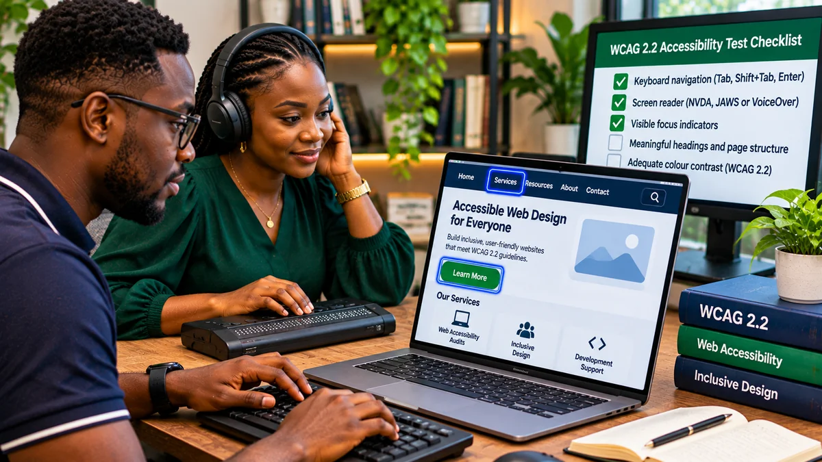
To test website accessibility using only a keyboard, put the mouse aside and try every important task using Tab, Shift+Tab, Enter, Space and the appropriate arrow keys. Then turn on a screen reader, such as NVDA or VoiceOver, and verify that headings, links, form fields, errors and changing information are announced clearly. These two exercises reveal barriers that automated scans often miss: invisible keyboard focus, menus that cannot be opened, unlabeled buttons and interfaces that announce the wrong state.
For businesses targeting WCAG 2.2 website accessibility, keyboard and screen-reader tests should form part of a broader evaluation—not be advertised as a complete conformance certificate. The World Wide Web Consortium (W3C) cautions that no single tool determines accessibility; knowledgeable human checks and a defined evaluation process are required. This guide explains what to test, what passing behaviour looks like and how to record problems developers can fix. Research verified 6 November 2026.
What does WCAG 2.2 require for keyboard and screen-reader users?
The Web Content Accessibility Guidelines (WCAG) 2.2 organise testable success criteria into Levels A, AA and AAA. Among the most relevant are keyboard operation, predictable focus order, visible focus, accessible names and programmatically conveyed structure. The distinction between levels matters: a useful best practice is not automatically a Level AA requirement.
| WCAG 2.2 criterion | Level | What to check |
|---|---|---|
| 2.1.1 Keyboard | A | Functionality can be operated through a keyboard interface, with a narrow exception for path-dependent movements |
| 2.1.2 No Keyboard Trap | A | Users can move focus away from components using a keyboard |
| 2.4.3 Focus Order | A | Focus sequence preserves meaning and operability |
| 2.4.7 Focus Visible | AA | Keyboard focus has a visible indicator |
| 2.4.11 Focus Not Obscured (Minimum) | AA | Focused components are not entirely concealed by author-created content |
| 2.4.12 Focus Not Obscured (Enhanced) | AAA | No part of the focused component is obscured |
| 2.4.13 Focus Appearance | AAA | A focus indicator meets stricter area and contrast measurements, subject to exceptions |
| 4.1.2 Name, Role, Value | A | Custom controls expose what they are and their states to assistive technology |
| 4.1.3 Status Messages | AA | Relevant status updates can be conveyed without unexpectedly taking focus |
W3C's WCAG 2.2 changes overview highlights Focus Not Obscured and other newer criteria. In particular, 2.4.11 at Level AA permits partial obstruction in some cases; fully unobscured focus is the more demanding AAA requirement. Teams should still aim for clear, generously visible focus indicators because technical minimums do not always provide comfortable usability.
Step 1: Choose representative pages and real tasks
Do not test only the homepage. Select the templates and workflows visitors actually depend on: navigation, article or product pages, search results, account sign-in, contact forms, booking steps and checkout. Include mobile layouts, long pages with sticky navigation, and pages that show validation errors or success messages.
Write a few tasks before starting: find a service using the navigation menu; search for a product; complete an enquiry form using invalid data and correct it; open and close a modal; and finish an order without the mouse. Use a safe staging environment for payments and destructive actions. W3C's WCAG Evaluation Methodology (WCAG-EM) recommends a defined scope and a representative sample when assessing conformance.
Step 2: Test the entire journey with keyboard navigation
Start a fresh browser session, disconnect or set aside the mouse, and work through each task. In most desktop browser interfaces, Tab moves forward through focusable controls and Shift+Tab moves backward. Enter typically activates links or buttons, while Space activates many buttons and toggles. Arrow keys operate controls such as radio groups, select menus and particular custom widgets; the exact behaviour depends on the control.
- Start at the top of the page and press Tab repeatedly. Note where focus begins and whether a “Skip to main content” link becomes available.
- Check whether each interactive item receives focus in an order that makes sense for the content and task. A layout can have an unusual visual order; the question is whether focus order preserves meaning and operation.
- Activate links, buttons, search controls, dropdowns and form submissions without touching a pointing device.
- Try Shift+Tab to reverse direction. Confirm there is no dead end or keyboard trap.
- Open then dismiss any overlay, navigation menu or dialog; verify that keyboard focus is managed sensibly.
- Repeat at a narrow viewport and with browser zoom, since fixed headers and footers can cover focused elements.
The W3C Easy Checks guide recommends examining logical tab order, visible focus, access to all functions and the ability to leave dropdowns and other widgets. A page that can be scrolled with the keyboard is not necessarily keyboard accessible: every essential action must remain usable.
Step 3: Inspect the focus indicator, sticky headers and overlays
As you tab, look for an obvious outline, underline, border or other focus indicator. Avoid CSS that removes focus styling without providing an equivalent. The WCAG 2.2 Level AA requirement 2.4.7 Focus Visible concerns whether focus is visible. The additional Level AA requirement 2.4.11 Focus Not Obscured (Minimum) checks whether author-created content entirely hides the focused component.
Test cookie banners, floating chats, sticky navigation bars, floating checkout buttons and consent panels. A focused link hidden completely behind a fixed footer can fail 2.4.11; a focus ring that is invisible may fail 2.4.7. Note that the stricter size-and-contrast rules in 2.4.13 Focus Appearance are Level AAA, not Level AA.
For developers, a clear :focus-visible style and appropriate scroll spacing can improve usability, but a code change must be tested in the actual layout, not treated as proof of conformance by itself.
Step 4: Test menus, dialogs and custom controls
Dropdown menus and modal dialogs often work with a mouse but fail for keyboard users. Open each menu using its supported key, navigate through available options and close it. Check whether the trigger reports expanded or collapsed state to a screen reader where relevant. A menu item that opens only on hover is a practical barrier.
For a properly implemented modal dialog, the W3C ARIA Authoring Practices dialog pattern describes focus moving inside when the dialog opens, Tab and Shift+Tab remaining within the dialog, Escape closing it and focus normally returning to a logical location. A deliberate focus loop inside a true modal is not the same as an unintended keyboard trap: the dialog must offer an exit.
Custom tabs, listboxes and accordions have different expected key patterns. Consult the ARIA Authoring Practices keyboard guidance instead of forcing every widget to respond to all keys identically. Prefer native HTML buttons, links and form controls where practical; adding ARIA roles alone does not implement keyboard behaviour.
Step 5: Set up a screen reader for manual testing
After keyboard-only testing, use an actual screen reader with a browser it supports. Useful starting combinations include NVDA on Windows with Firefox or Chrome and VoiceOver on macOS with Safari. JAWS is another widely used Windows screen reader. For mobile experiences, consider VoiceOver on iOS and TalkBack on Android, with appropriate gestures rather than assuming desktop shortcuts apply.
Screen readers have browse or reading modes, application/focus modes and their own navigation keys. Learn the basics before attributing an unfamiliar announcement to a website defect. WebAIM's NVDA testing guide and VoiceOver testing guide document useful controls.
| Task | NVDA example on Windows | VoiceOver example on macOS |
|---|---|---|
| Move among headings | H in browse mode | VO + Command + H |
| Navigate by landmarks | D in browse mode | Use VoiceOver rotor (VO + U) where supported |
| Inspect links, headings or landmarks | NVDA + F7 for Elements List | VO + U for rotor |
| Go to next form control | F in browse mode; Tab through controls | VO + Command + J or Tab |
| Activate selected control | Enter or Space, depending on control and mode | VO + Space |
“VO” is the VoiceOver modifier, normally Control+Option unless remapped; “NVDA” is the configured NVDA modifier, commonly Insert or Caps Lock. Exact commands vary with software settings and focus mode. A screen-reader test is more than listening to the page read from top to bottom: it must include navigating and completing tasks independently.
Step 6: Verify headings, landmarks and reading order
Open the screen reader's heading list or rotor. Can someone understand the page's structure without seeing its visual layout? Look for meaningful headings, a clear page topic and a sensible hierarchy. Heading levels should reflect actual relationships; simply making text bold and large does not create a heading for assistive technology.
Check whether main content, navigation, search and footer regions can be located via semantic landmarks. Listen to a paragraph or list in reading order and ensure the spoken sequence matches the intended meaning. A visually polished two-column card layout may be confusing when read in DOM order if labels and values are separated.
For a news article, test the headline, byline, publication date, section headings, related-story links and embedded media. For a business application, test the active branch label, page title, current task and any status controls. Heading and landmark navigation makes a long interface much easier to explore.
Step 7: Check links, icon buttons and images
Navigate through a links list without surrounding context. Repeated “Click here” or “Read more” links can be ambiguous when their destination is not distinguishable. The accessible name of a search button, menu toggle or icon-only control should tell users what it does; an unlabeled magnifying-glass icon may otherwise be announced simply as “button”.
For images, confirm that informative images have useful text alternatives conveying their purpose. Decorative images should generally be ignored by assistive technology. An image used as a link or button needs an accessible name describing the action, not merely its appearance. Avoid automatically adding lengthy alt text to every image regardless of context.
Check product images, charts, upload previews and error icons. Complex charts often need a nearby text summary or accessible data representation in addition to concise alt text. The W3C Images Tutorial gives examples of functional, informative, decorative and complex images.
Step 8: Test forms, validation errors and changing messages
Complete a form with only the keyboard, first using valid input and then deliberately triggering safe validation errors. With a screen reader, verify each input's label, required state, instructions and error message. Placeholder text alone often does not provide a durable accessible label. For radio buttons and checkboxes, make sure the question or group purpose is announced.
When a submission fails, can a user identify the affected field, understand the problem and correct it without guessing? When a search produces results or a cart updates, is the new status communicated without unexpectedly shifting focus? WCAG 4.1.3 Status Messages at Level AA addresses programmatic announcement of certain status updates; the implementation must be appropriate to the message and context.
WCAG 2.2 also adds relevant requirements beyond basic tab order, including 3.3.7 Redundant Entry (A) and 3.3.8 Accessible Authentication (Minimum) (AA) . For multi-step forms, check whether users unnecessarily re-enter information; for logins, assess whether people can use accessible methods such as password managers and paste where appropriate.
Step 9: Combine manual tests with automated checks
Automated scanners can flag some missing accessible names, colour-contrast issues, invalid relationships and markup problems. They cannot reliably judge the entire user journey, the helpfulness of an announcement or whether a focus sequence is understandable. The W3C accessibility evaluation overview explicitly says that no tool alone determines conformance.
For a thorough review, use automated checks to find repeatable technical issues, a keyboard-only pass to examine operability, screen readers to evaluate the accessibility tree and announcements, and user testing to uncover real-life barriers. W3C's guidance on involving users with disabilities explains why trained evaluation and lived experience complement one another. One short screen-reader session should not be described as a certified WCAG 2.2 AA audit.
Step 10: Record evidence and retest fixes
A useful accessibility report identifies the exact page and state, how to reproduce the problem, what happened, what should happen and which success criterion may apply. Record the operating system, browser, screen reader and version when relevant. Separate confirmed failures from recommendations or items requiring specialist review.
| Test case | Expected outcome | Evidence to record |
|---|---|---|
| Tab through navigation | All important functions operable in a meaningful order | Page URL, sequence and inaccessible control |
| Inspect visible focus | Focus visible and not entirely obscured at Level AA | Viewport, zoom, screenshot and overlay state |
| Open and close modal | Focus handled inside and exit available | Keys used and where focus returned |
| Navigate by headings | Useful heading hierarchy and page landmarks | Screen-reader headings list and observed reading order |
| Submit invalid form | Errors identifiable and correctable without a mouse | Field, announced label and error text |
| Update search or basket | Relevant status is conveyed and focus remains sensible | Trigger, announcement and focus location |
For severity, prioritise blockers that prevent completion of essential tasks, followed by serious confusion or inefficient navigation, while also correcting applicable WCAG failures. After a code change, rerun the original steps and a nearby regression test. Fixing the focus ring on one button does not prove that all overlays and controls behave correctly.
Common mistakes that lead to misleading accessibility results
Testing only with Tab: screen-reader users often navigate by headings, links, landmarks and tables; Tab typically does not visit every paragraph or static heading. Calling a modal focus loop a trap: intentional containment is expected in a real modal with an exit. Assuming ARIA makes a control operable: scripts must still support the relevant keyboard interactions. Reporting AAA as mandatory AA: WCAG 2.4.13 Focus Appearance is AAA, while 2.4.11 Focus Not Obscured (Minimum) is AA.
Also remember that keyboard and screen-reader testing do not cover every WCAG 2.2 criterion. Pointer target size, dragging alternatives, contrast, zoom/reflow, captions and other requirements need separate evaluation. For example, 2.5.8 Target Size (Minimum) is a Level AA pointer-input criterion with a 24-by-24-CSS-pixel baseline and specified exceptions; it cannot be cleared by keyboard testing alone.
A repeatable small-business accessibility testing schedule
For a small website, test the homepage, a representative content page and the main contact or purchase flow before a redesign or launch. Repeat focused keyboard and screen-reader tests after changes to navigation, menus, modals, forms, authentication and front-end frameworks. When there are many templates, sample each distinct interface and include important responsive states.
Assign an owner for reported issues, keep a simple reproduction log and include an accessibility check in the release process. If a checkout, booking or account-sign-in barrier blocks essential access, prioritise it over minor cosmetic improvements. Avoid claiming “WCAG compliant” merely because a plugin reports a high score. A full conformance claim requires evaluating all applicable criteria and conformance requirements within a defined scope.
Frequently asked questions
Can I test WCAG 2.2 using only my keyboard?
You can find many serious problems, including missing keyboard access, bad focus order and invisible focus, but keyboard-only testing does not assess all WCAG 2.2 criteria or all screen-reader experiences.
Which screen reader should a beginner use?
NVDA with a supported Windows browser and VoiceOver with Safari on macOS are practical starting points. Learn their reading and interaction modes before interpreting test results, and include additional platforms when your audience requires them.
Does a working screen reader prove WCAG 2.2 AA compliance?
No. A successful task in one screen-reader/browser combination is useful evidence, but broader testing and evaluation of all applicable success criteria are necessary for a conformance determination.
What is the WCAG 2.2 focus visibility requirement?
At Level AA, focus must be visible under 2.4.7, and author-created content must not entirely obscure the focused component under 2.4.11. The stricter focus appearance measurements of 2.4.13 are Level AAA.
Should every item receive focus when I press Tab?
No. Tab normally moves through interactive controls, not every heading or paragraph. Screen readers provide reading and structural navigation modes for non-interactive content.
Can an automated accessibility scanner replace a manual test?
No. Scanners can identify some technical problems but cannot reliably judge all interactions, semantics or practical usability. Combine them with manual evaluation and, where possible, testing with disabled users.
Conclusion: test whether people can complete real tasks
The most useful accessibility question is not whether a webpage displays an accessibility badge; it is whether someone can find information, operate controls, understand results and complete their task without relying on sight or a mouse. Start with keyboard navigation, check visible focus and dialog behaviour, then use a screen reader to assess page structure, names, instructions and announcements.
Use WCAG 2.2's actual success criteria to classify findings, document reproducible failures and retest every fix. Combine that work with automated checks, broader conformance evaluation and feedback from users with disabilities. The result is a more usable website and a more defensible accessibility improvement process.