
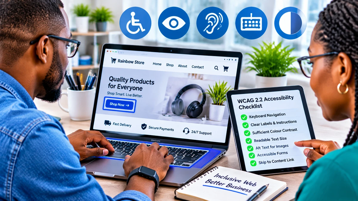
WCAG 2.2 Accessibility Checklist for Small Business Websites
A customer visits your website to buy a product, request a quote or book an appointment—but the checkout cannot be completed with a keyboard, the form error is announced only in red, or a sticky banner hides the active button. These are more than design annoyances: they can prevent people with disabilities from using an essential business service.
For most small businesses, the practical starting point is to audit important pages against the Web Content Accessibility Guidelines (WCAG) 2.2 Level A and AA, fix barriers in key customer journeys, and verify changes with both tools and human testing. That means checking keyboard access, text alternatives, contrast, responsive layouts, forms, login processes and the additional criteria introduced in WCAG 2.2.
This WCAG 2.2 website accessibility checklist translates the W3C standard into manageable tasks for a shop, restaurant, service provider, news website or small online business. It is a planning and testing guide—not a substitute for a full conformance evaluation or jurisdiction-specific legal advice. Research verified: 6 November 2026.
What WCAG 2.2 means—and which level should a small business target
WCAG is developed through the World Wide Web Consortium's Web Accessibility Initiative. The four principles are perceivable, operable, understandable and robust: users must be able to perceive information, operate controls, understand content and use it with assistive technologies. WCAG 2.2 builds on WCAG 2.1 and introduces nine new success criteria; it also removes the obsolete 4.1.1 Parsing criterion. The W3C recommends adopting WCAG 2.2 for new or updated accessibility policies.
The standard uses three conformance levels: A, AA and AAA. Level AA includes all Level A and Level AA success criteria, not just the newer additions. AAA goes further and is not generally recommended as a blanket requirement for entire websites. Businesses often use A/AA as a practical engineering target; applicable law, contracts or procurement rules may specify something different. Do not claim “WCAG 2.2 AA compliant” merely because an automated checker returns a green score.
A related FlyingEze article explains how confusing navigation and poor website design can frustrate customers . Accessibility builds on that usability work by testing whether people with different access needs can complete the same tasks.
The essential WCAG 2.2 website accessibility checklist
| Area | What to check on your website |
|---|---|
| Keyboard | Can customers use menus, buttons, dialogs and checkout without a mouse? |
| Focus | Is the focused control visible and not hidden by fixed banners? |
| Images | Do informative images have useful text alternatives, and decorative ones empty alt text? |
| Contrast | Can people distinguish text, controls, errors and visual indicators? |
| Zoom and mobile | Does content remain usable at 200% text resizing and narrow/zoomed layouts? |
| Touch and dragging | Are targets usable and drag-only interactions avoidable? |
| Forms | Are labels, instructions, required fields and errors understandable? |
| Authentication | Can people log in with password managers, paste and accessible alternatives? |
| Content and media | Are headings, link descriptions, captions and transcripts meaningful? |
| Help and consistency | Are repeated help options in consistent locations and repeated data reused? |
| Compatibility | Are controls named and exposed correctly to screen readers? |
| Testing | Have representative customer tasks been manually checked and retested? |
1. Make every important action work with a keyboard
Put away the mouse and use Tab, Shift+Tab, Enter, Space and the arrow keys where appropriate. Start on the homepage, then try product search, navigation menus, quantity selectors, contact forms and checkout. You should be able to move into and out of every interactive control without becoming trapped.
Under WCAG success criteria 2.1.1 Keyboard (A) and 2.1.2 No Keyboard Trap (A), most website functions need keyboard operation. Use semantic HTML buttons and links where possible, with appropriate handling for custom widgets. A clickable div that responds only to a mouse click is a common problem.
Check the visible focus indicator (2.4.7, AA). Do not remove outlines without offering a visible replacement. On mobile, test switches, menus and pop-ups with an external keyboard when available. Keyboard operation is necessary, but it does not replace testing screen-reader announcements.
2. Keep keyboard focus visible—even with sticky headers and pop-ups
WCAG 2.2 added 2.4.11 Focus Not Obscured (Minimum), Level AA. When a control receives keyboard focus, author-created content must not hide it entirely. Fixed navigation bars, promotional ribbons, cookie banners and persistent chat panels are common causes of failure.
Open your site at a smaller viewport and press Tab through each control. If focus moves behind a fixed banner, adjust the layout, scroll handling, overlay placement or focus management. Make sure a keyboard user can identify and activate the focused element.
The stronger 2.4.12 Focus Not Obscured (Enhanced), Level AAA calls for the focused component to be fully visible. The new 2.4.13 Focus Appearance, Level AAA adds specific focus-indicator size and contrast requirements. These are worthwhile improvements, but they must not be mislabelled as mandatory new AA criteria.
3. Give images, icons and multimedia accessible alternatives
Meaningful product photographs, illustrations and charts need appropriate alternative text. A picture of a blue office chair might use “Blue ergonomic office chair with adjustable armrests”. A search icon used as a button needs an accessible name explaining its action, such as “Search products”.
The W3C's images tutorial distinguishes informative, decorative and functional images. Purely decorative images should ordinarily use an empty alt="" attribute so assistive technology skips them. Avoid keyword-stuffed descriptions: the alternative should communicate what matters in context.
Provide captions for prerecorded videos with audio and appropriate audio descriptions or alternatives where required. Offer transcripts for relevant audio content. Videos explaining products or services should not depend exclusively on sound or on-screen text without an accessible counterpart.
4. Check colour contrast and do not rely on colour alone
For Level AA, WCAG 1.4.3 requires at least 4.5:1 contrast for ordinary text and 3:1 for large text, subject to specified exceptions. WCAG 1.4.11 also covers a 3:1 minimum for necessary visual information in many interface components and graphical objects, again subject to exceptions.
Measure your actual brand colours against their backgrounds using a contrast-checking tool. Check placeholder-like text, prices, small footer links, buttons, selected tabs, error messages and form borders. Do not signal a form error using red alone; add clear text such as “Enter a valid email address” and associate the message with the appropriate field.
Colour contrast is not the whole of legibility. Use readable font sizes, comfortable spacing and a clear hierarchy. Good colour choices should work in real page states, not only in a design mock-up.
5. Check zoom, reflow and mobile usability
WCAG 1.4.4 (AA) covers resizing text up to 200% without losing content or function, with specified exceptions. WCAG 1.4.10 Reflow (AA) generally requires content to work without two-dimensional scrolling at a width equivalent to 320 CSS pixels, with exceptions for layouts that genuinely require two dimensions, such as complex data tables or maps.
Test product grids, price tables, booking calendars, floating chat controls and long forms at narrow widths and increased zoom. Buttons should not disappear, labels should not overlap and the checkout should remain operable. Do not prevent browser zoom merely to preserve the visual layout.
Accessibility and speed are different tests but should both inform the user experience. FlyingEze's guide to Core Web Vitals and website performance explains why responsiveness and visual stability also matter to businesses.
6. Make touch controls large enough and offer alternatives to dragging
The new 2.5.8 Target Size (Minimum), Level AA generally calls for pointer targets to contain at least a 24 × 24 CSS-pixel area. It includes exceptions for adequately spaced smaller targets, equivalent controls, inline text links, unmodified user-agent controls and essential presentations. Therefore, “every link must be a 24-pixel square” is not an accurate summary.
In practice, larger, well-spaced buttons are often more comfortable for customers. Inspect tiny close icons, pagination links, shopping-cart controls, calendar dates and adjacent icons. The W3C's target-size explanation shows how the spacing exception works.
The new 2.5.7 Dragging Movements (AA) generally requires a simple, single-pointer alternative to an action involving dragging, unless an exception applies. For example, a sortable list can provide “Move up” and “Move down” buttons; a comparison slider can offer an input or buttons. Keyboard support alone does not automatically satisfy this separate pointer requirement.
7. Make forms easier to understand and correct
Every contact, booking, registration and checkout form should have visible descriptive labels associated programmatically with its controls. Placeholder text that vanishes on typing is not a reliable substitute for a label. Explain expected formats and required fields before users submit.
When validation fails, identify which field has a problem, describe the issue in text and explain how to fix it. Make sure the error can be discovered by keyboard and screen-reader users. The W3C forms tutorial provides examples of correctly associated labels.
WCAG 2.2 added 3.3.7 Redundant Entry (Level A): information already entered or provided during the same process should generally be auto-populated or available for selection when needed again. Exceptions apply where re-entry is essential, necessary for security or the previous information is no longer valid. A checkout asking customers to retype their address across multiple steps should be reviewed.
8. Allow accessible login and authentication
Login pages deserve special attention because an inaccessible sign-in can block the entire customer account. New success criterion 3.3.8 Accessible Authentication (Minimum), Level AA addresses cognitive function tests in authentication. It allows certain alternatives and supporting mechanisms—for example, password-manager support and the ability to copy and paste.
Do not disable password paste, prevent password managers from filling fields or force users to manually transcribe one-time codes without an accessible mechanism or alternative. Consider passkeys, appropriately accessible email links or other supported approaches, while maintaining strong security. If you use CAPTCHA or authentication puzzles, evaluate the precise criteria and exceptions rather than assuming every implementation is acceptable.
3.3.9 Accessible Authentication (Enhanced), Level AAA has a stricter approach to some exemptions. Businesses aiming for AA should implement 3.3.8 accurately; those seeking stronger accessibility can investigate the enhanced criterion as well. See W3C's authentication guidance .
9. Keep help, navigation and controls consistent
Customers should not have to hunt for the contact button on each page or relearn the meaning of common controls. Use consistent labels, menu patterns, search placement and logical headings. The new 3.2.6 Consistent Help (Level A) applies when specified help mechanisms—such as contact details, human support, self-help links or automated chat—repeat across pages in a set: keep their order relative to other page content consistent unless the user initiates a change.
This criterion does not require every small website to add a chatbot or place identical help text on every page. It asks for consistency where covered help features already repeat. A practical solution is a common contact/help region in the header or footer, tested on desktop and mobile.
The nine success criteria introduced in WCAG 2.2
| Criterion | Level | Practical question |
|---|---|---|
| 2.4.11 Focus Not Obscured (Minimum) | AA | Is keyboard focus at least partly visible? |
| 2.4.12 Focus Not Obscured (Enhanced) | AAA | Is the entire focused component visible? |
| 2.4.13 Focus Appearance | AAA | Does the focus indicator meet the stronger size/contrast requirements? |
| 2.5.7 Dragging Movements | AA | Can users perform the function without dragging? |
| 2.5.8 Target Size (Minimum) | AA | Are pointer targets sufficiently sized or covered by an exception? |
| 3.2.6 Consistent Help | A | Do repeated help mechanisms remain in consistent order? |
| 3.3.7 Redundant Entry | A | Can repeated information be reused within the same process? |
| 3.3.8 Accessible Authentication (Minimum) | AA | Does login avoid inaccessible cognitive challenges? |
| 3.3.9 Accessible Authentication (Enhanced) | AAA | Does login meet the stronger cognitive-access requirements? |
This is a summary of the additions, not the full WCAG checklist. Use the W3C WCAG 2.2 Quick Reference to review all applicable Level A and AA criteria, including those carried forward from earlier versions.
How to audit a small-business website without a large budget
Start with the pages that matter most: homepage, navigation, service or product page, contact form, account login, checkout or booking flow, and confirmation page. Include a mobile layout, modal dialog and any third-party payment or booking integration that users must interact with.
- Use an automated accessibility checker. Identify missing labels, obvious contrast failures, document structure issues and related problems; record the exact pages and components affected.
- Test with the keyboard only. Complete a real customer task without a mouse and note focus order, traps and invisible focus.
- Zoom and inspect narrow layouts. Check 200% text resizing, 320 CSS-pixel equivalent reflow and enlarged controls.
- Review images and content. Confirm alternative text, heading structure, informative link names, video captions and readable instructions.
- Test forms and login manually. Submit invalid fields, use password autofill and copy/paste, and verify messages are understandable.
- Try assistive technology. Use a supported screen reader/browser combination and, if possible, include people with disabilities in usability testing.
- Retest after fixes. Maintain an issue register containing page, WCAG reference, impact, owner, evidence and resolution status.
The W3C evaluation overview states that automated tools cannot determine conformance on their own; knowledgeable human evaluation is necessary. Free and commercial tools can help, but neither a perfect automated score nor an accessibility widget is proof that every customer journey works.
A realistic 30-day improvement plan
| Period | Priority | Deliverable |
|---|---|---|
| Week 1 | Audit key journeys and inventory problems | Issues ranked by severity, affected pages and WCAG criteria |
| Week 2 | Repair keyboard traps, missing labels, contrast and blocked forms | Working critical navigation, contact and checkout paths |
| Week 3 | Address new 2.2 criteria, zoom/reflow, content and third-party integrations | Retested desktop/mobile flows and accessible login |
| Week 4 | Independent checks, regression tests and maintenance planning | Documented findings, owner assignments and next audit date |
This is an implementation example rather than a guarantee of compliance in 30 days. A complex booking platform, PDF-heavy business or third-party checkout may require specialist remediation. Rank issues by customer impact: a completely inaccessible payment or contact flow deserves attention before cosmetic improvements to a low-traffic page.
Who owns website accessibility after launch?
Accessibility is not a one-time redesign. A business owner can make a named employee or agency responsible for reviews, while content editors check alt text, video captions and meaningful link labels before publishing. Developers should test reusable components, forms, authentication and modal behaviour when updating the site.
Ask third-party vendors for accessibility evidence, and test the actual integration; contractual assurances alone do not ensure that a customer can complete checkout. Consider publishing an accurate accessibility statement explaining your target, known limitations and how users can report problems. Do not describe the site as WCAG-conformant until the required scope and success criteria have actually been evaluated.
Frequently asked questions
Is WCAG 2.2 mandatory for every small business website?
Not automatically everywhere. Legal duties depend on jurisdiction, industry, services, contracts and applicable accessibility regulations. WCAG 2.2 is an internationally recognised technical standard; businesses should confirm their specific legal obligations rather than assuming the same rule applies worldwide.
Is Level AA enough?
Level AA is a widely used practical target and includes all Level A requirements. Some legal or contractual regimes may reference particular versions or additional requirements. A/AA conformance is evaluated across applicable pages and processes, not one selected homepage.
Does WCAG 2.2 require 44-by-44-pixel buttons?
No. New AA criterion 2.5.8 sets a general minimum target of 24 × 24 CSS pixels, with several exceptions. Designing larger touch areas can still improve usability. The 44 × 44 CSS-pixel target-size criterion is a different, higher-level WCAG provision.
Will an accessibility overlay make my website compliant?
No overlay can establish conformance by itself. Problems in page structure, interactive controls, content and workflows often require changes to the underlying website and manual evaluation.
Can I use free tools to test my site?
Yes, automated checkers and browser tools can find many problems. Pair them with keyboard, zoom, screen-reader and real-task tests. No automated scan can verify every WCAG requirement.
Conclusion
A useful WCAG 2.2 accessibility checklist for small business websites starts with the tasks customers need to complete. Make navigation keyboard-friendly, keep focus visible, provide informative image alternatives, improve colour contrast, support zoom and touch, and make forms and authentication manageable for more people.
Then audit the nine additional WCAG 2.2 criteria, fix the highest-impact issues, and verify the outcome through human testing. The goal is not merely to display an accessibility badge—it is to ensure customers can find information, contact the business, book services and make purchases without avoidable barriers.