MANY homeowners like to give their rooms a seasonal refresh, which means now is the perfect time to get your space cosy and warm for autumn.
And if you plan on adding some of the trends and colours from this time of year, that could mean opting for some darker shades.
 Dark colours are popualr inside home in autumn
 But some worry it can make a space look smaller
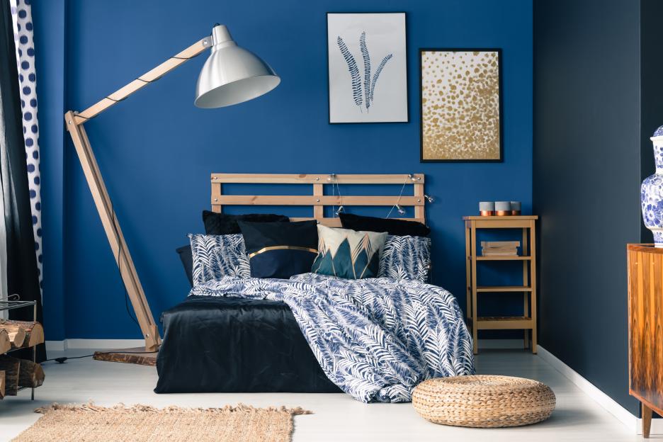 Experts have revealed how you can use dark colours without making the room small
But with that comes the fear of making your home feel and look cramped, dark and dreary with less sunlight getting in.
Luckily, interior experts are on hand to show us how we can use dark paint without making the room feel small and gloomy.
Lucy Steele, Paint and Interiors Expert from V&CO, has revealed that it’s actually a common misconception that dark colours create tight spaces.
While they can feel intimidating when decorating your home, darker shades don’t always make a room feel enclosed and compact.
Contrary to traditional thinking, dark paint can actually create the illusion of a larger space – when used strategically.
So to help, Lucy has shared her five tips on how you can use dark paint whilst also making your room feel spacious.
Use warmer undertones
If you’re opting to use a dark colour, it’s important to know that its undertone could have a major impact on the room.
Choosing the right shade can make your room feel warm and spacious, while others have a colder, compact feel.
Lucy explains: “When selecting a darker paint colour, it is important to consider the undertone of the shade.
“By opting for shades with a warmer undertone, you can ensure a darker colour still has plenty of softness.
“These undertones, such as reds, oranges, or yellows within the darker hue, will prevent the room from feeling cold or dull.
“Instead, they give the space a sense of warmth and vibrancy, making it feel more inviting and welcoming despite the darker colour choice.”
 Double drenching can be used to make a room feel more spacious
Double drenching technique
Another clever colour trick that can help make a room with dark tones feel more spacious is using the double drenching technique.
This is an interior trend which sees a room painted using two or more closely related colours to create a rich, immersive, and dramatic look.
The goal is to eliminate stark colour contrasts, creating a cohesive yet vibrant and sophisticated atmosphere from floor to ceiling.
Lucy says: “Double drenching a room is the perfect technique for opening up a space when using a darker paint colour.
“Double Drenching consists of painting the ceiling, along with doors, windowsills and skirting boards, in a lighter tone of the same colour as the walls.
“This painting technique will create the illusion of a more expansive and open space.”
What rooms should I use dark colours in my home?
IF you're thinking of using dark tones in your home but aren't sure what rooms to put them in, don't worry. We have you covered.
Here is a list of the best dark shades to use in different rooms around the home.
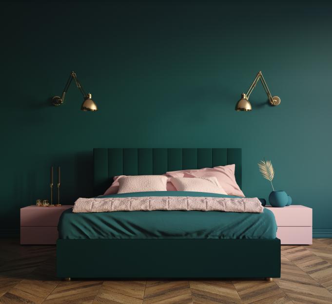
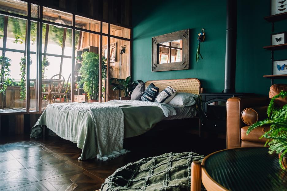
Bedroom – Rich and grounding shades like deep blues, forest greens, charcoal greys, deep purples, and burgundies can create a calming, luxurious atmosphere.
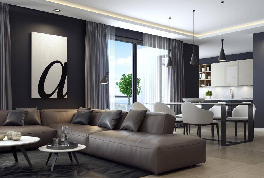
Living room – Charcoal grey, midnight blue, forest green, deep plum, olive, and espresso brown are great for this space as it can create a dramatic, cosy, and sophisticated atmosphere.
Kitchen – The best dark colours for this room are dramatic shades like dark blue, charcoal grey, rich brown, and dark green, which add a sense of depth and character but work well with lighter elements.
Bathroom – Deep blues, rich greens, charcoals, plums, and earthy browns can make a bathroom feel like a sophisticated retreat.
Strategic lighting
It can be hard to make sure a room stays nice and bright – especially during the winter with little to no sunlight.
And this can be even trickier if you have dark walls.
Which is why having plenty of artificial lighting, placed strategically around the room, is key.
Lucy reveals: “It’s important to ensure that there is a good amount of artificial lighting if the room is suffering from low light.
“This can come in the form of mirrors and also plenty of lamps with softer, more yellow bulbs.
“Layering these at different heights and angles throughout the room will maximise the brightness, allowing your beautiful wall colour to glow.”
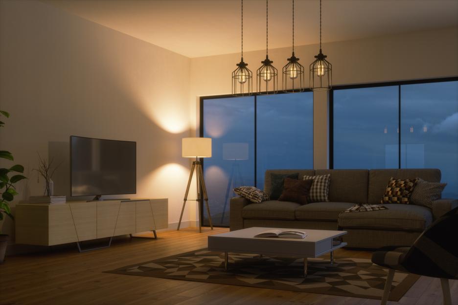 Strategic lighting can make a huge difference to a room
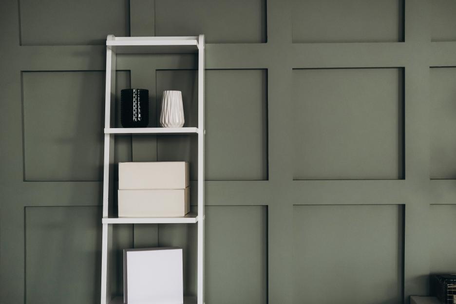
Lighter elements
If you have dark colours, then it’s important to lighten up the space with other elements.
This can be from using other lighter paints for accents, brighter furniture, or even bright photos or artwork.
Lucy advises: “Choosing lighter coloured furniture, or bright artwork, can break up the darkness and add visual balance in a dark painted room.
“These elements will stand out against a dark backdrop and help bounce light around the room, preventing the space from feeling too enclosed and heavy.
“The contrast also adds interest and keeps the room feeling dynamic and layered rather than flat.”
Soft furnishings
If you’d like to use dark colours but are worried that it will make the place look harsh, then gentle furnishings can make it feel much softer.
And, at the same time, make it look warm and spacious.
Lucy suggests: “Soft furnishings like cushions, throws, and rugs can help a dark room feel more spacious by adding texture and contrast.
“Lighter coloured materials soften the overall look, create visual depth, and draw the eye around the room.
“This can make the space feel bigger rather than compact and cramped.”

Eze Chidiebere Paul
I'm dedicated to creating high-quality content that informs, inspires, and delights. If you have any questions or suggestions, don't hesitate to get in touch. Happy reading!