Table of Contents
MIDDLESBROUGH has officially revealed their new club crest, set to be launched next season in celebration of the club's 150th anniversary.
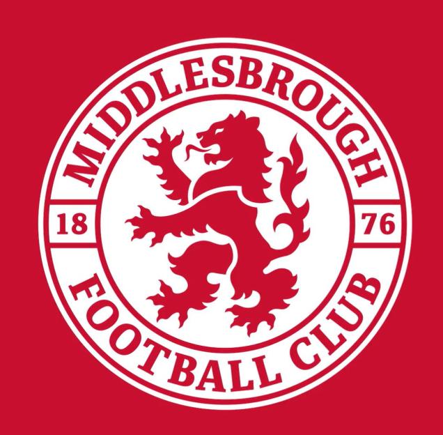
The updated badge is a contemporary interpretation of the cherished 1986 crest and features several subtle elements that reflect the club's history.
 Middlesbrough has updated their current badge (above) for the club’s 150th anniversary
A gold and red version will be featured on shirts next season to celebrate the team's 150th anniversary, followed by a permanent return to the traditional red and white colors.
The badge was crafted by graphic designer Andy Pattison, a dedicated Boro supporter.
He collaborated with artist Joanne Grogan to bring the club's vision to fruition.
Pattison has previously designed badges for other clubs but described the Boro project as the “pinnacle” of his career.
Discussing the design process, Pattison stated: “Our aim was to prioritize the fans' voices.”
“The feedback indicated a deep affection for one of the past crests: the 1986 crest.”
More than 4,000 fans participated in a survey regarding the badge design, allowing the club to create a crest that supporters would take pride in.
Many fans requested that the new crest resemble the 1986 badge while incorporating elements that represent the local area and the club's history.
To honor the fans' wishes, the badge features a profile of Roseberry Topping nestled between the lion's mane and body, while the lion's tongue is shaped like the River Tees.
The year of the club's founding, 1878, is displayed prominently across the center of the badge, and for the special anniversary, the detail of Ayresome Gates frames the number 150.
Matt Barber, the club's marketing manager, commented: “Today marks an exciting milestone as we officially unveil the new club crest.”
“This has been an 18-month journey to reach this point. With the club's 150-year anniversary approaching, we felt it was a perfect opportunity for this change.”
“The initiative was driven by fan demand, and we received substantial feedback indicating a desire for a change moving forward.”
The announcement has generated mixed responses on social media, with some users even accusing Boro of “borrowing” the design from another club.
One enthusiastic fan remarked: “We’ve never been more back, put that in the center of the home shirt next season and I will spend all mymoney on it.”
Conversely, another fan expressed disappointment: “What a letdown.”
One user questioned: “Did we seek permission before borrowing their club crest?”
Another commented, “Chelsea… but red.”
A third fan praised the badge as “perfection.”
 Middlesbrough unveils new badge that resembles the 1986 crestCredit: X/Boro
Frequently Asked Questions
What inspired the new Middlesbrough club crest design?
The new crest design was inspired by fan feedback, particularly the affection for the previous 1986 crest. The design also incorporates elements that represent the local area and the club's history.
When will the new crest be officially used?
The new crest will be officially launched next season to coincide with the club's 150th anniversary.
Who designed the new club crest?
The new club crest was designed by graphic designer Andy Pattison, who collaborated with artist Joanne Grogan.


