
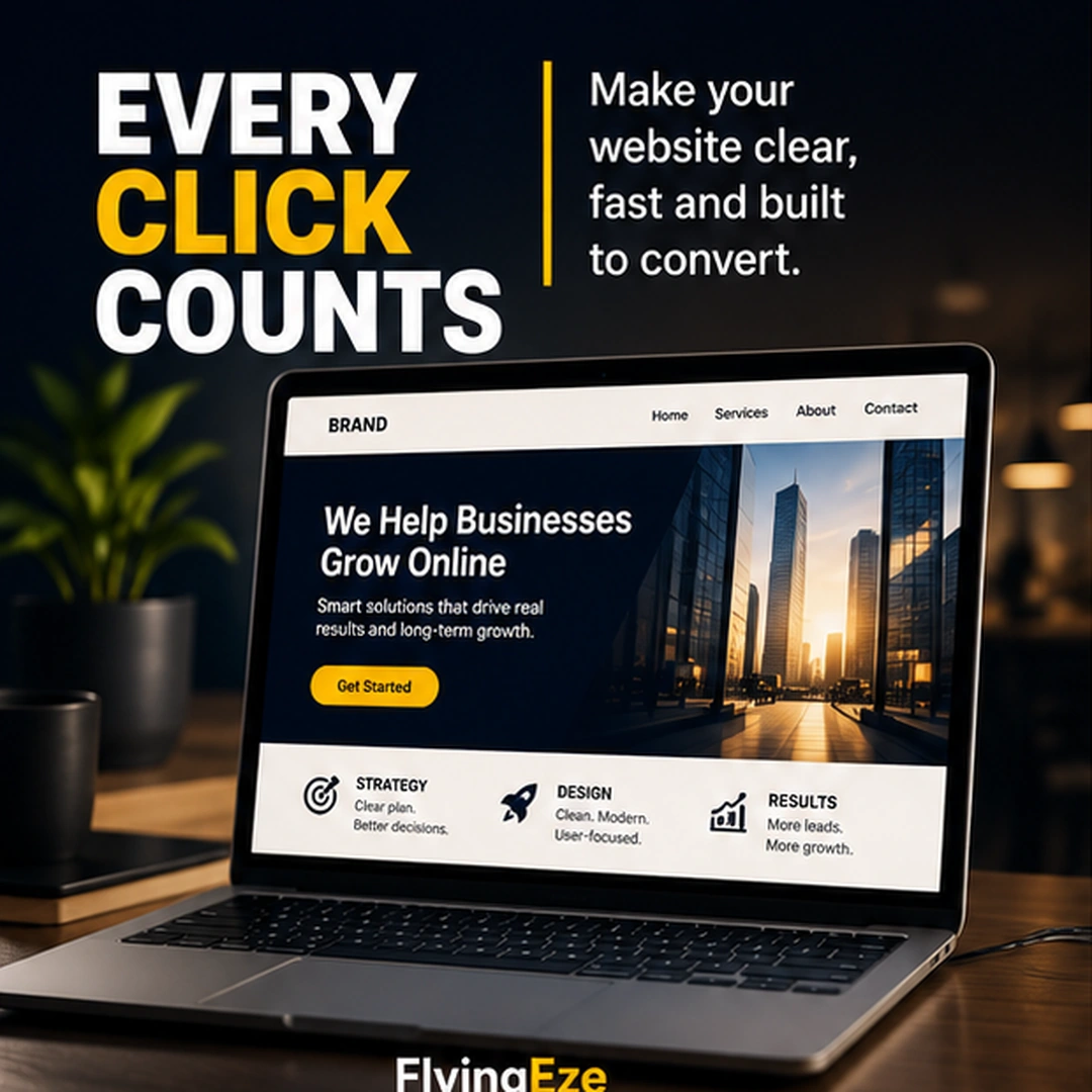
A business website should not make visitors stop and wonder:
“What am I supposed to do next?”
Every important page should have a clear purpose.
That purpose might be to help someone:
- Learn about a service
- Request a quote
- Book an appointment
- Make a purchase
- Contact the business
- Download a resource
- View pricing
- Continue exploring related information
The goal is not to fill every page with buttons.
It is to make the next useful action obvious.
More Buttons Do Not Always Create More Opportunities
It can be tempting to add several calls to action because each one seems useful.
A homepage might contain:
Contact Us
Get Started
Learn More
Book Now
View Services
Request a Quote
Subscribe
Individually, each button may make sense.
Together, they can create competition for attention.
When every action looks equally important, visitors have to decide which one matters.
That weakens the page's information hierarchy.
Good design helps people understand what deserves their attention first.
Identify the Most Valuable Next Step
Review an important page on your website and ask:
What is the single most useful action a visitor could take after reading this page?
For a service business, that might be:
Request a Quote
For a consultant:
Book a Consultation
For an online store:
Shop Products
For a software product:
Start Free Trial
For an educational article:
Read the Related Guide
Once you identify the primary action, make it easy to see and easy to understand.
Primary and Secondary Actions Can Work Together
Choosing one primary action does not mean removing every other option.
Secondary actions can remain available.
For example:
Primary: Request a Quote Secondary: View Our Services
Or:
Primary: Buy Now Secondary: Learn More
The difference is visual priority.
The primary action should receive more emphasis, while secondary actions remain available without competing for the same level of attention.
This creates a clearer path through the page.
Use Specific Call-to-Action Language
Buttons such as “Submit”, “Click Here”, or “Continue” can sometimes be unnecessarily vague.
Whenever possible, tell the visitor what will happen.
Compare:
Submit
with:
Request My Quote
Or:
Click Here
with:
View Pricing
Or:
Continue
with:
Book Your Appointment
Clear wording reduces uncertainty.
The visitor should understand what the action means before clicking it.
Think About the Visitor's Stage
Not every visitor is ready to buy immediately.
Someone discovering your business for the first time may want to understand your services before requesting a quote.
Someone who has already compared several providers may be ready to contact you immediately.
Your website can support both situations.
The important thing is to avoid forcing every visitor toward the same action regardless of context.
A service page might prioritise:
Request a Quote
while still offering:
See How It Works
An article might prioritise:
Read the Next Guide
while providing a quieter option to:
Contact Us
The action should make sense for the page and the visitor's likely intent.
Mobile Matters
Your call to action may look perfect on a desktop and become frustrating on a phone.
Test important pages on mobile.
Ask:
- Is the button easy to see?
- Is the text readable?
- Is the tap target large enough?
- Does anything cover the button?
- Does the form work comfortably on a small screen?
- Does the visitor have to scroll excessively before reaching the action?
A conversion path that works only on a large screen is incomplete.
The Click Should Deliver What You Promised
The experience after the click matters too.
If a button says:
View Pricing
it should lead directly to useful pricing information.
If it says:
Book a Consultation
the next screen should make booking straightforward.
If it says:
Download the Guide
the visitor should not have to navigate through several unrelated pages first.
The label creates an expectation.
The destination should fulfil it.
Remove Unnecessary Friction
Sometimes the problem is not the button itself.
It is everything that happens afterwards.
A visitor clicks Request a Quote and finds a form with 18 required fields.
Someone clicks Contact Us and discovers there is no obvious way to reach the business.
A customer clicks Buy Now and encounters a confusing checkout.
Each unnecessary step creates another opportunity to abandon the process.
Review the entire journey:
Interest → click → form or page → completion
Then ask:
Which steps are genuinely necessary?
Simplifying the path can often be more valuable than adding another conversion feature.
Good Conversion Design Is Not Manipulation
Conversion optimisation sometimes gets associated with tricks designed to pressure visitors into taking action.
That should not be the goal.
Good conversion design helps people make decisions with less confusion.
It provides:
- Clear information
- Logical navigation
- Honest calls to action
- Predictable outcomes
- Simple processes
The visitor should understand what will happen and remain in control of the decision.
The objective is not to trick someone into clicking.
It is to remove unnecessary uncertainty between interest and action.
Try This Homepage Audit
Open your website homepage and answer these questions:
- What is the main purpose of this page?
- What should a new visitor understand first?
- What is the most valuable next action?
- Is that action immediately noticeable?
- Does the button clearly describe what happens next?
- Are other buttons competing with it unnecessarily?
- Does the complete journey work well on mobile?
- After clicking, is the next step simple?
If those answers are unclear, the page may need simplification before it needs additional features.
Why It Matters
A visitor who is interested in your business should not have to work hard to figure out what comes next.
Good website design creates direction.
It helps people move naturally from:
attention → understanding → trust → action
That does not mean every page needs an aggressive sales button.
It means every important page should have a reason to exist and a logical next step.
Every click should have a purpose.
And every important action should make that purpose clear.
For more practical digital insights, visit FlyingEze.