A FRESH coat of paint can be a great way at giving your home a new look.
However, there’s a particular colour you’ll want to avoid if you’re planning on putting your on the market any time soon.
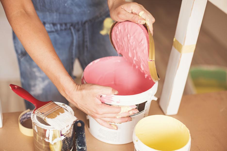 An interior design expert explained why you should avoid painting your home pink (stock image)
A home expert has revealed the shade to steer clear of when painting your space.
Jessie Brooks, product manager at Davincified , a platform offering custom paint-by-numbers kits, revealed how choosing the wrong colour could knock thousands off a property’s value.
Only a handful of shades stand the test of time when carrying out a home makeover.
However most tend to fall flat over the years, according to the Daily Mail .
Colour to avoid
Paint colour can shape how a space feels and how large it looks, sometimes making the difference for potential buyers when picturing themselves living there.
The expert pointed out that while certain shades can initially look “appealing” it “can drain the life out of a room” once it is added to the walls.
Jessie revealed that certain shades of pink, particularly muddy blushes and outdated bubblegum tones, are a no-go for .
She explained that some pinks have dominated interiors over the past few years and are now starting to show their age.
According to the pro, muddy blush tones, which look like greyish, muted pinks, may look sophisticated at first but quickly turn dull and lifeless on walls.
“These muddy pinks lack warmth, they don’t reflect light well, so rooms feel smaller and darker. Over time, they just look dingy,” the expert said.
On the other hand, bubblegum pinks presents a different issue, according to the interiors pro.
While bold and fun initially, they date fast and what feels playful at first looks juvenile after a while.
This can make it difficult for potential buyers to see past them when viewing a home.
“Trendy colours have a short shelf life,” the interior expert pointed out.
“When you’re repainting every few years just to keep up, you’re wasting time and money.”
Dunelm's top interior design trends for 2025
Maximalism
Maximalism is about unleashing your creativity and bringing joy to everything around you, day in and day out. Bold pattern combinations of florals, checks and geometrics set the tone with a bright joyous colour palette that holds everything together.
Don’t mistake Maximalism for having loads of stuff, it’s about mixing and matching florals, layering key pieces and storytelling throughout your home, and ultimately doing things your own way. Dunelm’s new collaboration with Sophie Robinson is all about that.
Minimaluxe
The interiors world has witnessed the evolution of “minimalism” into a richer, more luxurious iteration. The goal is quiet luxury – simplicity with a sense of sophistication.
Minimaluxe focuses on creating spaces that are pared down yet warm, elegant, and inviting. Gloriously tactile textures, in a palette of warm neutrals, with hints of caramel and gold, complete the look. Introducing softer forms and round edges to avoid a space feeling overly stark
The Edit
Built on the philosophy that having fewer thoughtfully designed and well-made things helps us leave a lighter imprint on the earth. Interior design is shifting to be inspired by the natural world, and all its perfect imperfections.
Take Dunelm’s The Edited Life collection , it focuses on natural materials like wicker, jute and linens – as well as décor pieces and hand-thrown pottery vessels that feature forms dictated by the artisan’s mark. Soft relaxed fabric textures mixed with uneven wood grains help bring this neutral, look together.
New Nouveau
Blending 19th century inspired maximalism with a contemporary colour palette this collection takes inspiration from the ornamental art form from the Nouveau era. Rich and luxurious, blending a little bit of history with a more modern aesthetic you can mix and layer into your home.
Stylised Lily motifs adorn sumptuous textiles and wallpapers mixed with marbling & stained glass vintage style lighting for a vintage inspired look, with a modern twist.
Estate agents consistently report that certain wall colours put buyers off, with a poll finding a staggering 40% of buyers would reduce their offer if they disliked the interior colour palette.
And pink sits near the top of that list of disliked colours, with viewers immediately start calculating redecoration costs when they walk into a pink home.
“Buyers want to move in without major work,” the interiors pro explained.
“If they’re faced with repainting entire rooms before they can settle in, they’ll either walk away or knock money off their offer to cover the hassle.”
Better option
Meanwhile, neutral tones let buyers imagine their own furniture and style in the space.
The interior pro suggested looking at warmer terracotta tones or soft peachy shades that add more depth and complexity to your space.
“Terracotta has been used in homes for centuries because it’s warm, earthy, and works with almost any style,” she explained.
“Rather than competing with your furniture or artwork, it complements them.”
And for anyone seeking something lighter, soft creams with warm undertones create a gentle, welcoming feel.
These shades help to reflect light beautifully, make rooms feel larger, and work with any decorating style.
And greiges, grey-beige hybrids, also have staying power because they’re genuinely neutral.
They don’t impose a specific mood or style, meaning they won’t feel dated in a few years time.
“The best wall colours are ones you stop noticing,” the expert pointed out.
“They should enhance the space and let your furniture, art, and personal touches take centre stage.”
More on interior design
Plus, another Brits are guilty of today and what to do instead to make rooms look bigger and fresher.
The four , including the “new millennial grey”.
Plus, the five , including two cosy paint shades that “elevate” spaces.
The that’s set to take over this festive season.
And how one mum nabbed a “free” .

Eze Chidiebere Paul
I'm dedicated to creating high-quality content that informs, inspires, and delights. If you have any questions or suggestions, don't hesitate to get in touch. Happy reading!