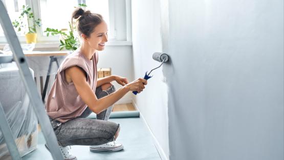
WE all want to add a little bit of colour to our homes â it can make a space feel uplifted, energised and cosy whilst also showing off a little bit of our personality.
And greens and blues are popular choices since they create a calm environment, which also feels bright, relaxing, and inviting.
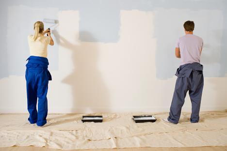 Experts have urged homeowners to avoid putting a new colour on their walls
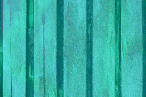 ”;Olo’ has recently been discovered by scientists
But there’s one newly discovered shade in this colour range that interior experts have urged homeowners to stay clear of, explaining that it is too brash for your house.
Scientists have recently found the colour ‘Olo’, which is an ultra-saturated, blue-green hue, and it is already making waves online.
But experts at The Paint Shed have said that it is the kind of shade that is better admired from afar than splashed across your walls.
Olo is only visible when the eye is manipulated, and Prof. Ren Ng, one of the researchers behind Olo, explains that this is because the remarkable shade as more saturated than any colour you can see in the real world.
As a result, the professionals predict that it will inspire a peaked interest for similar shades with extreme saturation.
But they have urged homeowners to think twice before bringing similar colours into their interiors.
Michael Rolland, paint expert and Managing Director atThe Paint Shed, said this is because it can be too brash and bold for a home and can even ruin the vibe of a room with “colour overload”;.
He said: “There are many blue and green shades that work beautifully in the home.
“From lighter green pistachios to rich, heritage-feel navy, many hues are versatile, easy to style, and easy to work with.
“However, ‘Olo’ is described as the opposite, making the world’s other bold colours feel like pastels.
“If homeowners seek this kind of saturation for their interiors, they might be left with colour overload.
“Highly-saturated shades like Olo can bring difficulties with them, chiefly being too bold and brash.
“Especially in spaces that should be cosy and calm, for example, the living room.
“If you want to use a more saturated shade of green in your home, try incorporating it into alcoves and as feature points rather than a full room or wall, as this could create an overly harsh look and feel.”;
So, what shades should you use in your home, if not ones that are Olo-inspired?
The Paint Shed has revealed that no paint company can recreate Olo because the saturation of it can make it feel overwhelming.
However, the experts say they think the colour most similar to Olo on the market is the formulaS 1050-B80G by Dulux Trade.
Michael added: “Many paint companies don’t make a shade that comes close to the saturation of this colour, as it can be so overwhelming.
“As such, unless you’re painting a small feature or accent, I’d recommend opting for a more subdued turquoise for interior projects.
“For example, Little Greene’s GreenVerditerorBrighton, which is significantly more pastel in tone.”;

Eze Chidiebere Paul
I'm dedicated to creating high-quality content that informs, inspires, and delights. If you have any questions or suggestions, don't hesitate to get in touch. Happy reading!