STOKE fans were left fuming after the club changed their badge to a design “no one wanted.”
The Championship outfit left supporters shocked as they unveiled a new crest from the 2026/27 season.
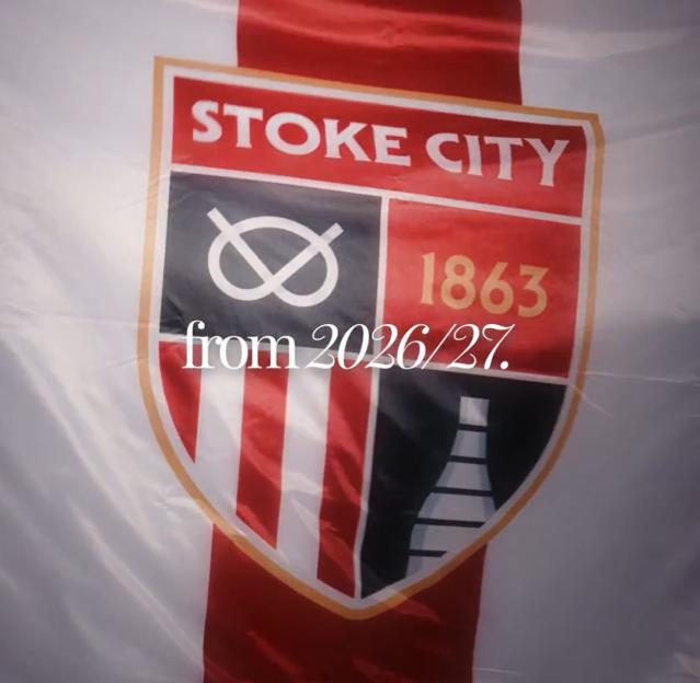 Stoke have unveiled their new club badge design… supposedly by popular vote
Boasting a “modern” twist, it takes the traditional Stoke badge and transforms it into something well suited for the new era of football.
Stoke claim that fans were surveyed over whether they wanted a new badge.
It’s added that 68% of those asked backed the fresh design.
But many on social media were left fuming about it.
One said: “No one wanted this.”
Another declared: “Don’t fix something that doesn’t need fixing. Terrible decision.”
One noted: “This is truly c**p.”
Another added: “Looks horrible.”
Reflecting on the new design, Stoke’s COO Simon King said: “The crest is an integral part of the Club’s heritage and this will, therefore, go down as an historic moment for Stoke City.
“Our approach from the outset has been to put our fans at the heart of the process, allowing them to form an identity that truly represents them.
“Every supporter that has engaged, as well as those who have quietly put their faith in the Club, all have our sincere thanks.
“A huge amount of hard work has gone into bringing the project to this point, from within the Club, from our design agency Drummond Central and from Stoke City Connect whose check, challenge and guidance has been invaluable.
“We are also grateful to the FA and EFL for their guidance around the process to ensure that we comply with the relevant regulations around this change.
“The end result is something that represents the history and tradition our supporters are proud of, and for which Stoke-on-Trent is renowned, and I believe that’s the best place to be.
“We are looking forward to our new crest becoming an integral part of the identity of our club from the 26/27 season and for many years to come.”

Eze Chidiebere Paul
I'm dedicated to creating high-quality content that informs, inspires, and delights. If you have any questions or suggestions, don't hesitate to get in touch. Happy reading!