MK DONS have been slammed after they revealed their new badge.
The side revealed their new crest on social media on Tuesday.
MK, who finished in 19th in the fourth tier, have had a dismal second season back in the ‘s basement division.
That has led to uproar amongst the club’s fanbase, and they have been ridiculed on X since the announcement of their new logo.
In a statement on the club’s website, MK said that the new crest was more than a badge.
“It’s a reflection of who we are and where we’re going. It brings together our heritage, ambition, and modernity in a way that’s built to stand the test of time.”;
It delved deeper into the process behind the switch, acknowledging ‘ roundabouts as a key inspiration.
“The circular shape represents unity and strength, echoing our belief in ‘One City, One Club’,”; the announcement continued.
“But it also nods to something closer to home, Milton Keynes’ iconic roundabouts. It’s a subtle tribute to the city’s unique identity, woven seamlessly into the heart of our new look.”;
One fan said that MK were the “pinnacle of tinpot”;, while another commented: “That looks horrendous! You’ve saved me money on kits going forward as I won’t be wearing one with that on it.”;
“Who voted for this? Not good,”; another comment read.
One fan went even further, tweeting: “You know there’s f*** all historically to your club when you base your new badge on roundabouts”;, adding laughing and pointing emojis.
Port Vale, who went up automatically from League Two this season, have mocked their rivals on X.
The Valiants posted jokey annotations of their current crest in a reply tweet to MK’s original post.
Those included “Two of these”; and “Not a steak bake”;, with corresponding arrows pointing to menial parts of their badge.
The post had fans in fits of laughter, with one commenting: “Admin I love you”;, and another “Sharp wit is an understatement Admin”;.
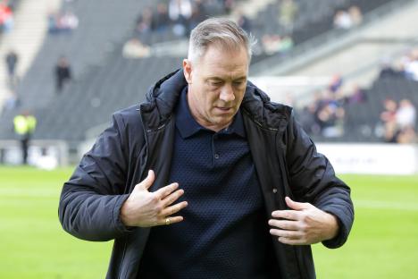
The Buckinghamshire oufit finished fourth last term under Mike Williamson, the former United manager, but were thrashed 8-1 on aggregate by Crawley Town in the play-offs.
The scoreline was the largest play-off defeat in EFL history.
This term, more misery has been piled onto MK, with promotion hopes dashed prematurely after a run of four defeats in the club’s opening six games.
That included a 3-0 humbling at the hands of arch-rivals , which included a late brace from Callum Maycock.
That result prompted Williamson to leave his post, with Scott Lindsey dropping down from Crawley to take the reins.
However, his tenure was short-lived, as he was fired in March after just two wins in 14 games.
Paul Warne, the former boss, took over at the helm with four games to play, and he oversaw three draws and a win in that time.