MARSEILLE have infuriated fans after making a controversial change to the club’s iconic crest.
The French giants revealed the new badge for the first time in 22 years in an attempt to make it more modern.
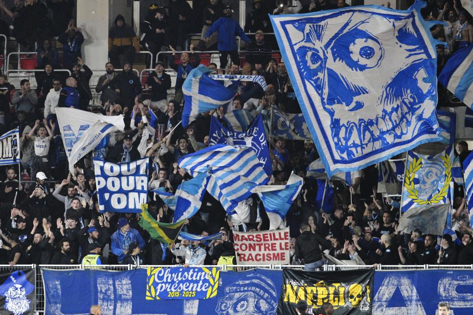 Marseille fans have protested the club’s change of badgeCredit: AFP
 The new badge has gone down the modern route
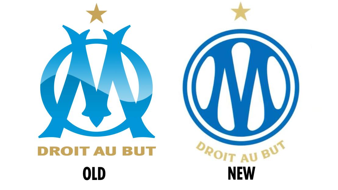
Marseille’s previous badge was recognisable thanks to its big blue “M” and “O” which represented the club’s full name .
It also included the club’s slogan “Droit au But” which translates to straight to the goal.
The slogan had been a staple of the badge for its last seven editions, dating back to 1981.
It also appeared on historic badges that were designed 1910 and on the club’s first ever emblem in 1899.
The new version is much more minimalist and is formed with an “M” inside an “O” and the removal of the slogan for a lot of its use on social media.
The gold star which represents the club’s 1993 success, has also gone in most versions.
They are included in the full design, but it can not be seen in the club’s display pictures on platforms such as X and .
They are also removed in a lot of the example imagery put out by the club as they are not present on scarves or phone cases that could be sold.
Fans have been left fuming with the change as they made their thoughts known ahead of the 3-1 win over FC Metz.
An X-rated banner was unfurled in the stands, slamming the change by the board.
It read: “A logo just like the season: a total pile of s**t.
“S**t logo, unstable team, you’re f**king everything up.”
Fans on social media have also hit out at the new design of the badge with one comparing it to the logo.
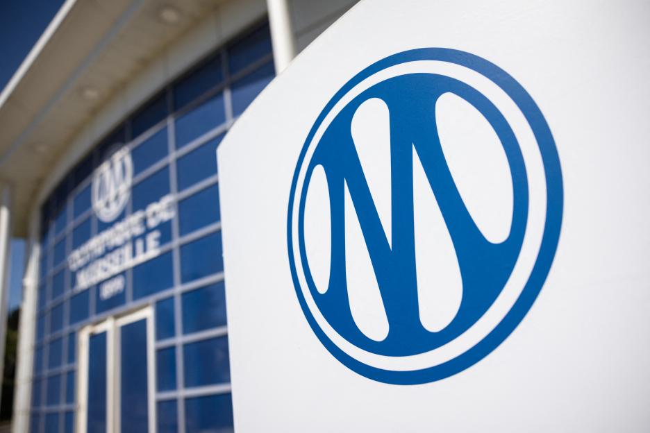 The new badge is often displayed without the club slogan or iconic starCredit: AFP
 Three badge changes that sparked outrage
Here is a look at three badge changes in football that led to uproar from fans...
- Leeds United – 2018
Leeds tried to change their badge in 2018 but the decision was reversed due to anger from fans.
Over 77,000 supporters of the club signed a petition to reverse the change and the change was cancelled.
- Juventus – 2017
The Italian giants changed their iconic logo for a much more modern and simplistic design of a “J”.
Fans slammed the change on social media calling it to corporate and soulless.
- Barcelona – 2018
Barcelona tried to remove the “FCB” from the club’s logo back in 2018 and reduce the number of stripes in the crest.
However, the changes were stopped from happening due to outrage from supporters.
The new badge is described as honouring its history and that the free-moving M represents the “water, wind and fire” of the club.
A statement read: “The new logo modernises our iconic badge while honouring its history.
“A clean, geometric structure gives strength and clarity, while the ‘M’ moves freely — echoing the water, wind, and fire of Marseille.
“Structured yet alive. Historic yet bold. Rooted in the city, driven by its people.
“More than a redesign, it’s Marseille itself — restless, passionate, and always in motion.”
The fans have also been left displeased with the team’s efforts in this season.
The club sits 3rd in the league but are 11 points behind leaders despite playing two more games.
The win against Metz ended a run of consecutive 2-1 defeats in the league to and Lille.

Eze Chidiebere Paul
I'm dedicated to creating high-quality content that informs, inspires, and delights. If you have any questions or suggestions, don't hesitate to get in touch. Happy reading!